UX Engineering
Your loading spinner is probably making things worse
Skeletons and spinners feel like good UX. Measured against perceived performance, most of the ones I have shipped made the page feel slower. What to use instead.
Mr. Rofiq Rahman · · 6 min read
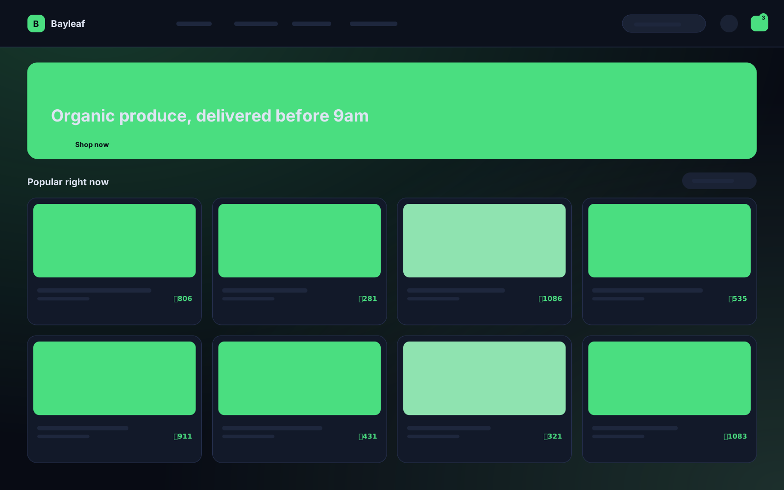
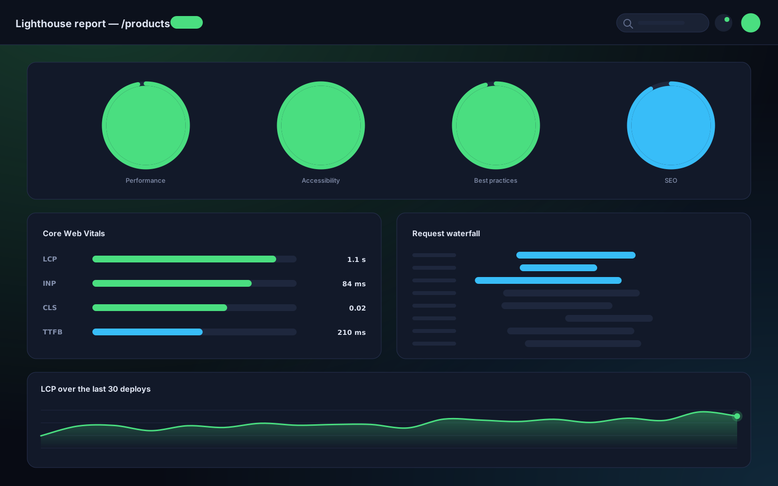
I used to add a skeleton to everything. It felt responsible. Then I watched session recordings of the storefront I had just rebuilt, and the skeletons were the slowest-feeling part of a very fast page.
Three cases, three answers
Under 300 ms: show nothing. A flash of skeleton that disappears before the eye settles reads as a glitch, not as progress. Below roughly 300 ms, people do not perceive a wait at all — they perceive a flicker.
300 ms to about a second: keep the old content, dim it slightly. React's useTransition is built for this. The previous result stays on screen at reduced opacity while the new one loads. Nothing jumps, nothing disappears, and the page feels continuous.
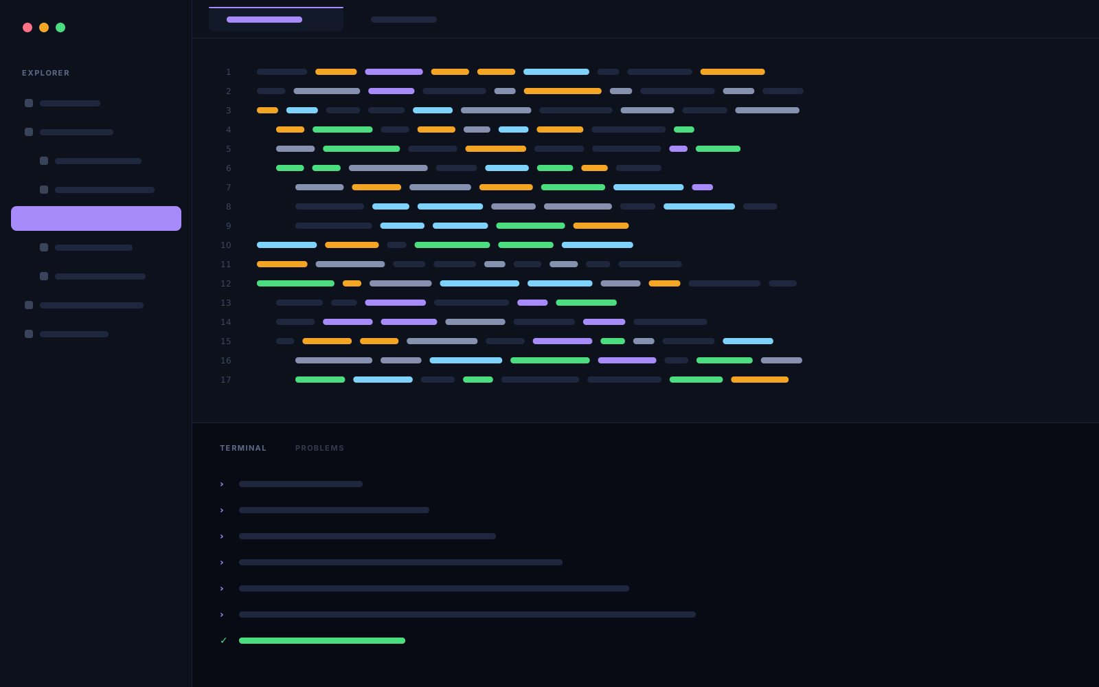
const [isPending, startTransition] = useTransition();
// ...
<div className={isPending ? "opacity-60 transition-opacity" : ""}>
  <Results items={items} />
</div>
Over a second: a skeleton that matches the real layout. Not grey blobs — a skeleton with the same number of rows, the same heights, the same column widths. A skeleton whose shape differs from the content causes a layout shift when it resolves, which is the worst of both worlds.
On a statically rendered page, show the content
This is the one that embarrassed me. If the page is prerendered, the content is already in the HTML. Wrapping it in a client component that shows a skeleton for one frame is adding an animation to a page that was instant.
The honest version
Most loading states exist because the developer could see the pause in development with a throttled connection. Check what the pause actually is in production on a real device first. Often there is nothing to cover up.