<R/>

Crafting digital experiences

<R/>Rofiq.Full-Stack Product Engineer
AboutServicesWorkBlogRésuméContact
Let's talk

One project slot open

Got something worth building? Let's make it real.

Start a project
<R/>Rofiq RahmanFull-Stack Product Engineer

Full-stack product engineering for teams that want the thing shipped, measured and maintainable.

Explore

AboutServicesWorkBlogRésuméContact

More

RésuméPrivacy policyUses — tools, hardware and setupRSS feed

Connect

© 2026 Rofiq Rahman. Crafted with Next.js.

Back to top
All articles

Accessibility

Accessibility work I do on every project, in order of payoff

Not a WCAG checklist. The specific things I do on every build, ranked by how much real difference they make per hour spent.

Mr. Rofiq Rahman · Jul 22, 2026 · 9 min read

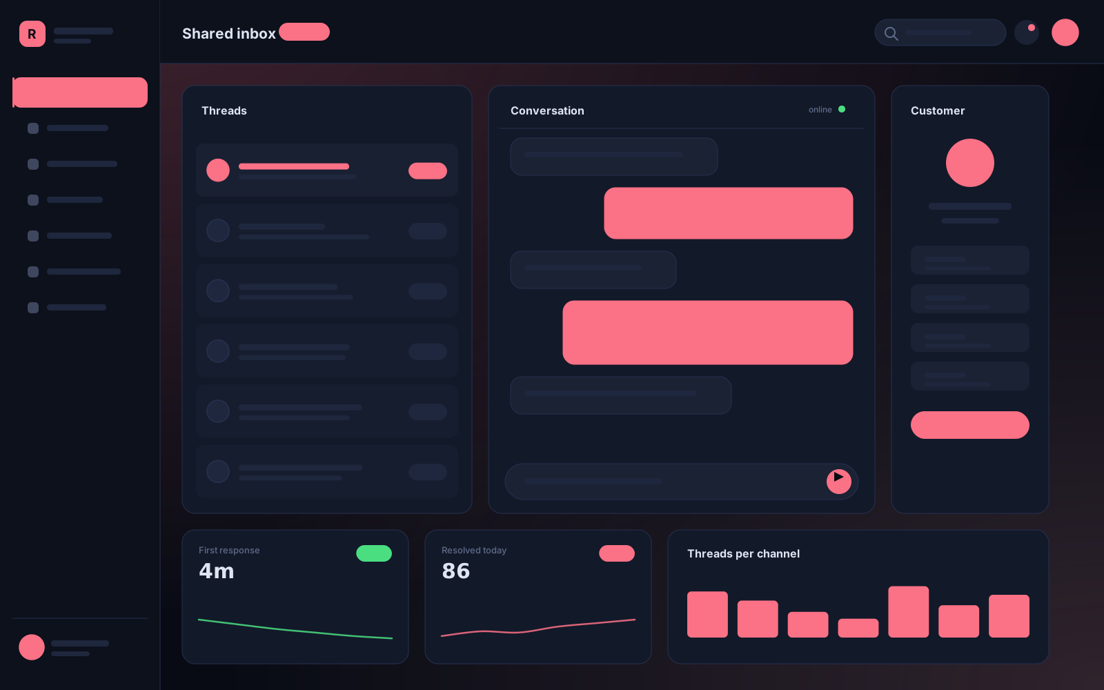
Team inbox interface with a clearly focused conversation row

On this page

  1. 1. Use the right element
  2. 2. Label every input, visibly
  3. 3. Keep a visible focus ring
  4. 4. Check contrast while designing, not after
  5. 5. Announce what changed
  6. 6. Then test with a screen reader

An accessibility audit at the end of a project produces a list of forty items and a negotiation about which ones get fixed. Doing these from the start produces a site that mostly passes.

Ranked by payoff per hour.

1. Use the right element

A button that is a div with an onClick is the single most common failure I find, and it breaks keyboard access, screen readers and the browser's own focus handling in one go. Native button, a, label, input, details. Free behaviour you would otherwise reimplement badly.

2. Label every input, visibly

Placeholder text is not a label: it disappears when you type, fails contrast in most designs, and is not reliably announced. A visible label tied by htmlFor costs nothing and helps everyone, not just screen-reader users.

3. Keep a visible focus ring

Someone removes the default outline because it looks untidy, and keyboard navigation becomes a guessing game. Style it instead:

:focus-visible {
  outline: 2px solid var(--ring);
  outline-offset: 2px;
}

4. Check contrast while designing, not after

AA is 4.5:1 for body text, 3:1 for large text and UI components. Catching it in the design file costs minutes; catching it after the component library is built costs a redesign.

5. Announce what changed

When a filter updates a result list, a sighted user sees it. Everyone else needs aria-live="polite" on a short status region: "24 results". One line.

6. Then test with a screen reader

Thirty minutes with NVDA or VoiceOver on your two main flows will find things no automated tool reports. It is uncomfortable the first time and routine by the third.

Automated tools catch perhaps a third of real issues. The list above is most of the rest, and none of it is slow once it is habit.
  • #accessibility
  • #wcag
  • #html
  • #forms
Share

Keep reading

Related articles

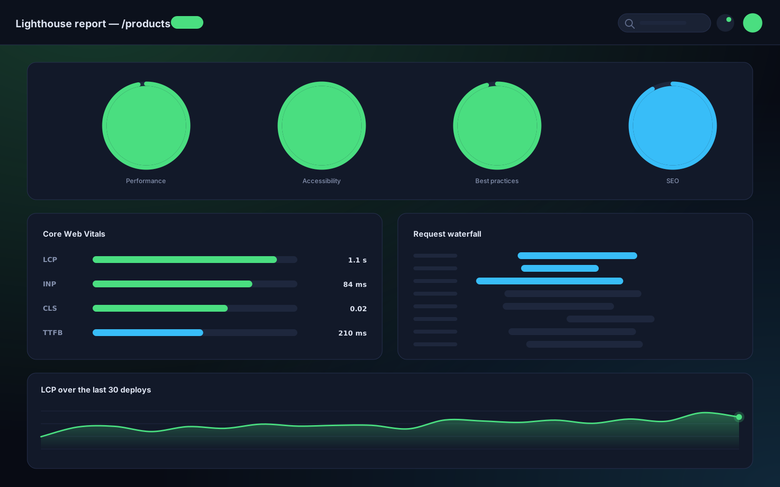
Lighthouse report with category scores, Core Web Vitals and a request waterfall

Performance · Oct 9, 2026 · 8 min read

A performance budget that survives the deadline

Every team agrees the site should be fast, right up until the marketing tag goes in on a Thursday. Here is the setup that makes the budget hold without anyone having to be the villain.

#performance#core web vitals#next.js
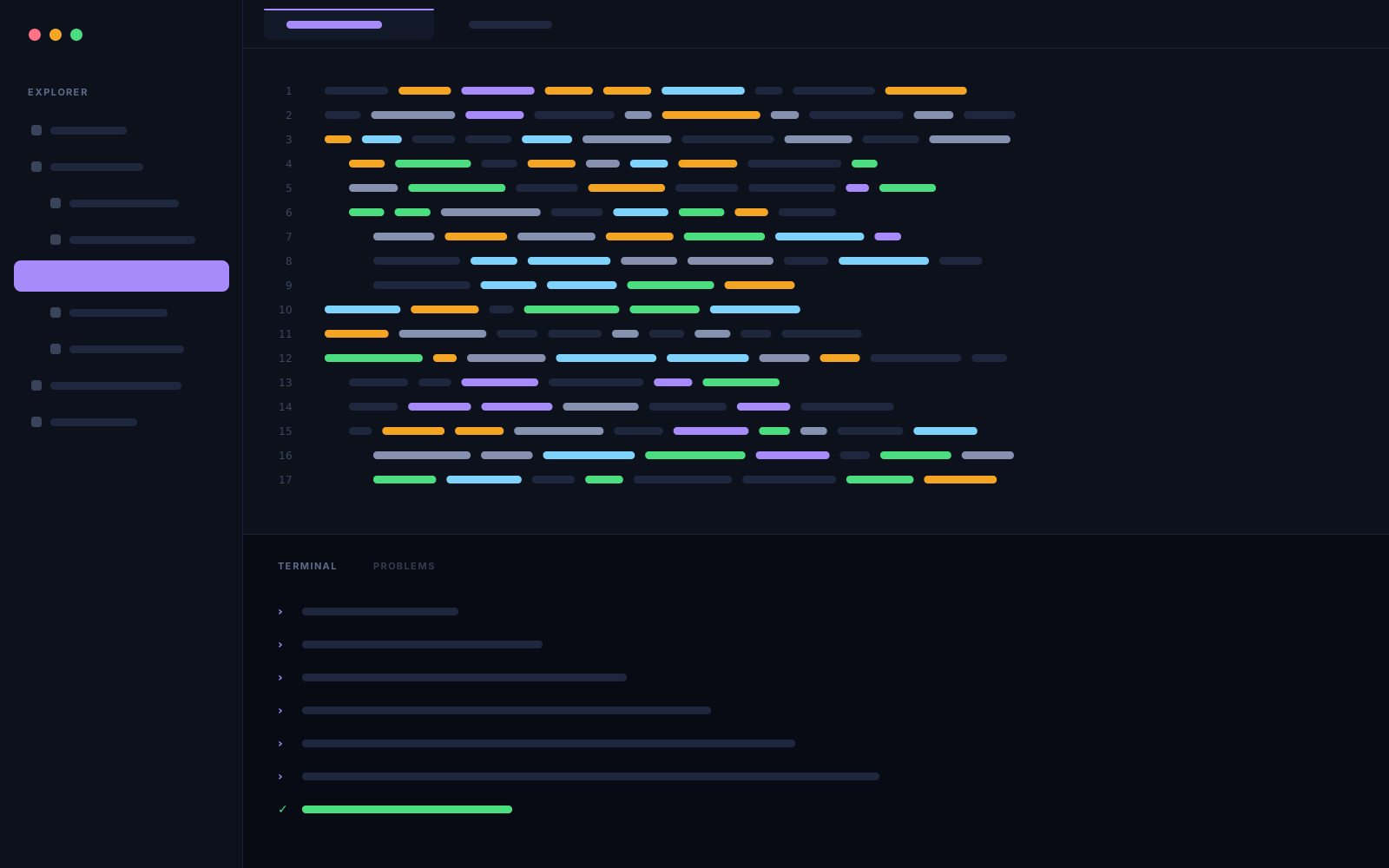
Code editor with a file tree, an open component file and a terminal below

Next.js · Sep 24, 2026 · 11 min read

Server components changed how I structure a Next.js app

After six App Router projects, the folder structure I keep arriving at — and the three mistakes I made in the first two that cost me the most time.

#next.js#react#server components
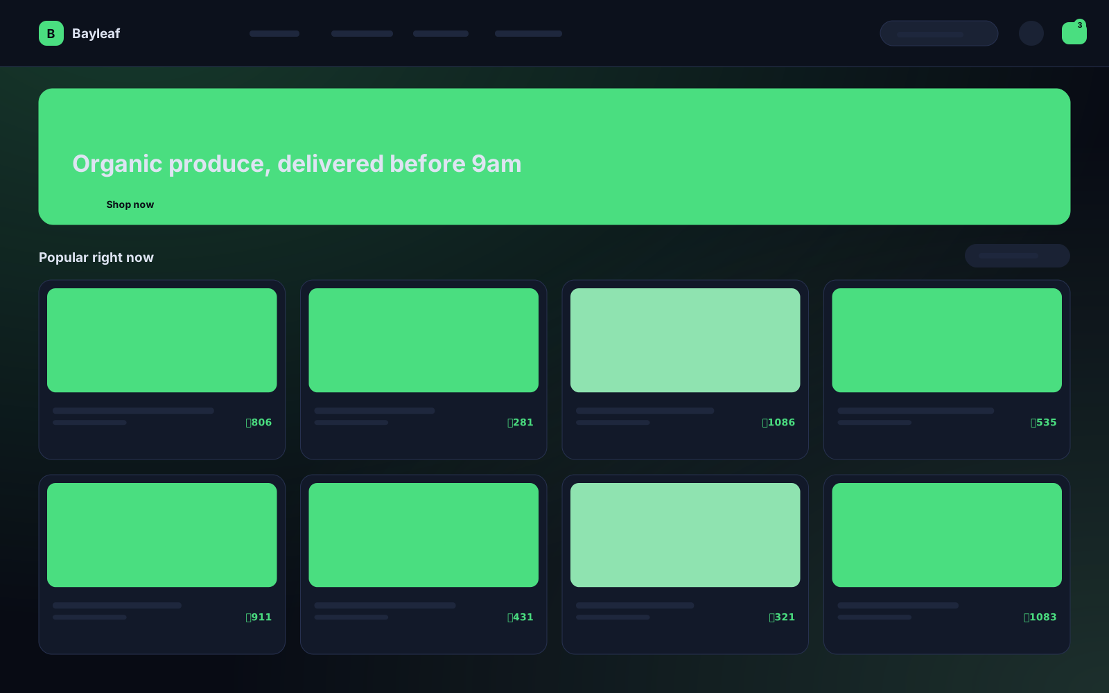
Storefront product listing with a promotional banner and product grid

UX Engineering · Sep 7, 2026 · 6 min read

Your loading spinner is probably making things worse

Skeletons and spinners feel like good UX. Measured against perceived performance, most of the ones I have shipped made the page feel slower. What to use instead.

#ux#performance#react